Watch TV
-
Watch TV is an app designed and developed by Monscierge to display over-the-air, premium cable, or IP-based television content. Learn more about the finished product.
-
UX and Visual Design. I conceptualized, designed and led the creation and implementation of the app. I worked with an engineer who held a similar passion for design, user experience, and our mission to change how hospitality TV is viewed.
-
I was tasked with redefining the hospitality TV experience. The goal was to be able to ingest over-the-air or premium TV channels within an app available for guests staying in a hotel with Monscierge's Apple TV for Hospitality product.

The process began with research into "standard" consumer-based channel guides. Since its public debut in the 1980's the electronic program guide has not substantially changed in its primary visual language. A thinned down EPG was required for a hospitality setting which didn't include much of the consumer options like DVR or even detailed audience listing.

The first explorations reduced the visual content of a standard grid as a lightweight overlay onto the live content. Visbility and clarity issues with text-heavy and other background movements limited the overall effectiveness.
Additional explorations followed a more structured grid view with the inclusion of preview and content logo and minimal meta data content. While it was a functional solution, it didn't inspire a feeling of being a modern experience that matched the rest of the Apple TV experience.

A split screen method that allowed selecting of channels was created. This layout would be displayed atop a blurred and darkened moving background. A live build was created with dummy data and tested by people ranging from 18-64. Ultimately, navigation tests proved that the mechanism to select channels and see upcoming shows was cumbersome.

The layout was condensed into a single scrollable pane with mostly horizontal scrolling to select a channel. Current and future programming was displayed. The entire layout was injected on top of blurred and darkened live programming. This layout was also built as a live prototype and tested very positively despite some occasional issues with legibility.

Early tests identified that the blurred programming still caused legibility issues, which caused me to ditch that functionality in favor of a blurred and abstracted background. The background was softened and could be semi-themed for hotels but by default was presented in a blue style. This app was tested by users 18-64 in addition to hotel staff and other key stakeholders. They loved the modern feel and look of the app compared to "old school grid."

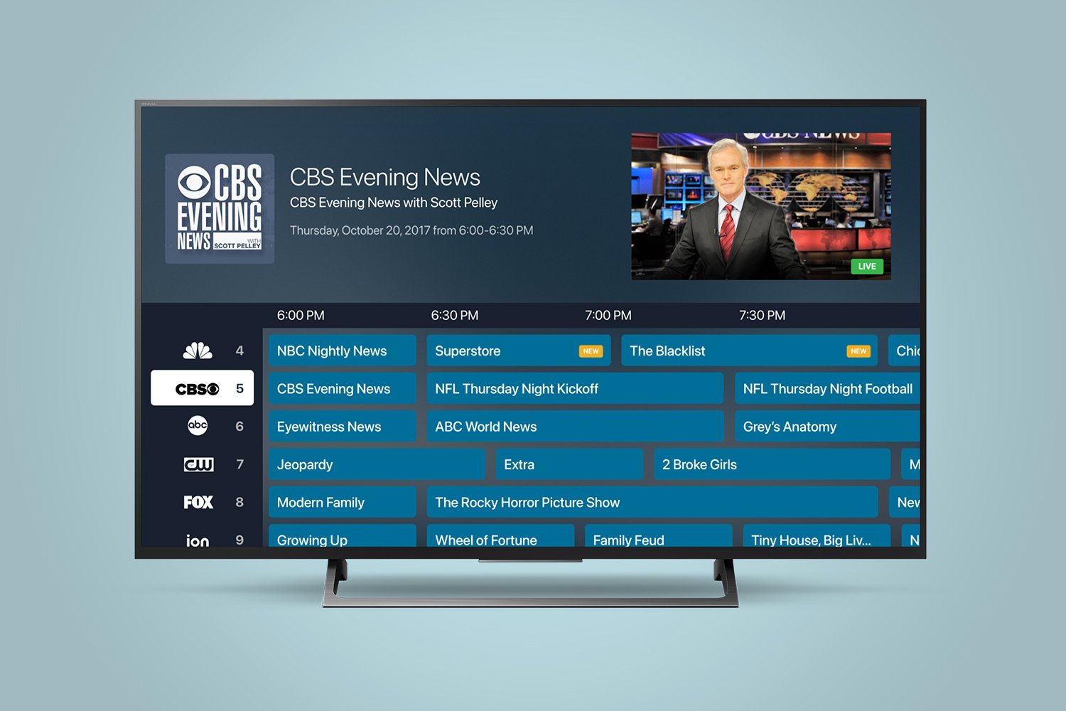
I gathered feedback from hotel guests and staff and learned that there was occasionally issues with the perception of content on the left and right and how scrolling interacted with content. I solved one of the issues by flipping the content so the preview is on the left and the channel information is on the right. This led to an easier immediate understanding of looking at future shows. It also emphasized programming as opposed to channels, which eased the need to maintain as many specific type of channel logos.

The layout led to a revamped structure that blended multiple methods together. Cards presented programming for each channel. When a card was focused the upcoming programming would also be displayed directly underneath. The new layout was A/B tested across a few hotel floors and received overwelmingly good reviews.

The next phase is the addition of genre and search functionality. Some hotels wanted upwards of 100+ channels and as a result ways to find specific programming or channels was frequently requested. The addition of Genres for filtering types of shows is the result of additional meta content available for programming which allowed me to group different shows and types of shows together. The ability to essentially sort by a type of show created a new way for people to also find groups of channels (such as sports or news).